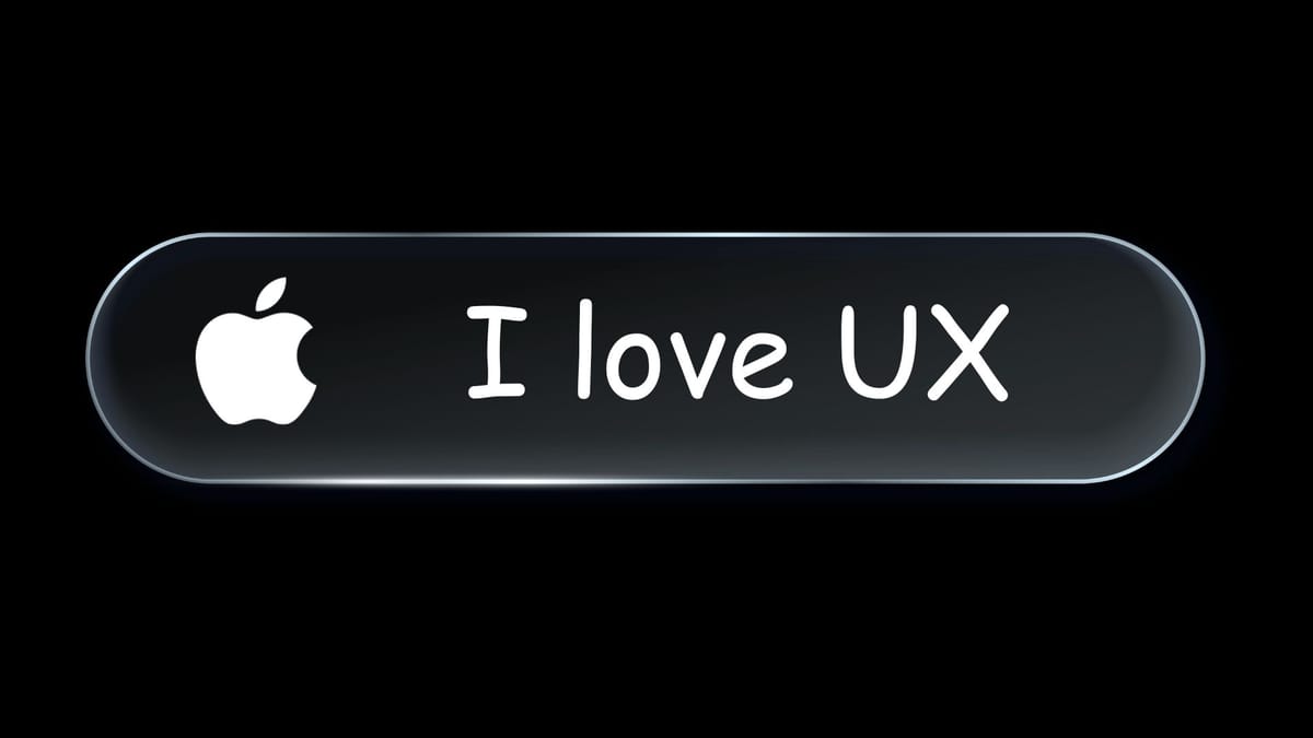
Liquid Glass and prioritizing looks over UX
Form should follow function.

This has got to be one of Apple’s biggest UX fails since they decided to put the charging port on the bottom of the Magic Mouse.
Apparently, window resizing in Tahoe works when you click outside the window corner, which contradicts every physical and digital interaction paradigm ever.
Here’s what Norbert Heger has to say about it:
Since upgrading to macOS Tahoe, I’ve noticed that quite often my attempts to resize a window are failing.
This never happened to me before in almost 40 years of using computers. So why all of a sudden?
It turns out that my initial click in the window corner instinctively happens in an area where the window doesn’t respond to it. The window expects this click to happen in an area of 19 × 19 pixels, located near the window corner.
Jason Snell’s sentiment in the matter is spot on:
That’s right, folks, the solution to resizing the corner of a window in Tahoe is to click outside the edge of the window. I can’t even.
It’s a great reminder of why convention is better than novelty when your design decisions affect millions.
The project management explanation for this is: “This is what happens when you don’t include testing in the Definition of Done.”
The UX explanation for this is: “This is what happens when you prize a look without considering user interaction.”
The marketing explanation is: “This is what happens when you need a shiny object to talk about.”
The coding explanation is: “This is when you say, don’t worry about the bugs—just ship it.”
I haven’t upgraded to Tahoe yet, and I only recently upgraded to iOS 26.2, And overall, I’m not thrilled about the change. The overlays, the animations, the very rounded corners—it all feels a bit…extra. I agree with Derek Sivers (with the exception of actually hating my computer and being resentful):
Apple is frustrating. Awesome hardware, but awful software. I did the recommended upgrade to Mac OS “Tahoe” last month, but it’s SO awful! Ridiculous extra-rounded corners make everything take up more space on the screen. It looks so bad that for the day I used it, I found I was hating my computer and resentful.
Speed kills. Bad things in product design happen when you chase an aesthetic devoid of utility. There’s a ton of room for creativity, for whimsy, for breaking the mold, but if it doesn’t function, it’s foolish.