Making lo-fi Gantt charts in Google Sheets
The quickest way to block out a project schedule.


A Gantt chart is a simple visual representation of a project’s schedule that shows how different tasks in the project overlap over time. Originally developed by Henry Gantt in the 1900s, Gantt charts are a staple of project management—especially for projects with a clear, predetermined scope.
Today, many modern project management applications provide functionality for building Gantt charts out of task lists. I use Basecamp for project management, which does not provide native functionality for creating Gantt charts. I appreciate the 37Signals philosophy of rolling To Do lists that expand and shrink based on an evolving understanding of the work that needs to be done—it’s kind of like doing agile project management without calling it that.
But sometimes you need to see a 30,000 foot view of how a project is going to fit within it's start/stop dates. As an example, our marketing department has three team members and each of us have three projects that need to be completed before the end of the quarter for a total of nine projects. Every project is competing for limited resources (our time) against a fixed schedule (the quarter). Each project has a number of drop-dead milestones that need to be hit.
Gantt charts shine in this scenario because they provide an opportunity to see where the major milestones deadlines will fall across projects, which helps immensely with the following:
- Right-sizing the projects to fit the time allotted
- Seeing where pre-determined events and holidays fall and how they might impact the schedule
- Providing an easy visual of how heavy each week will be in terms of project work
Creating Gantt Charts in Sheets
You don’t need fancy project management software to make a functional Gantt chart. All you need is a spreadsheet program and a little know-how about Conditional Formatting and the SUM function.
This approach comes from Chris Croft, a project manager and trainer based in the UK. I discovered Chris Croft years ago (I think through LinkedIn learning), and even then he was talking about creating get charts in Microsoft Excel. He has a great video from 13 years ago that explains how to build a sheet for this from scratch.
Gantt Chart Excel Dem0 (Chris Croft)
Here's the gist of the process
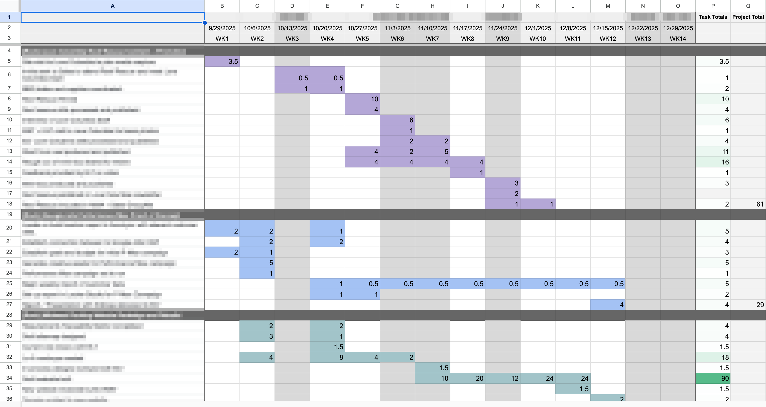
- Reserve Column A for key milestones and tasks.
- Use the first row for dates (weeks are best). I tried putting every day of the week, and it just wasn't the right fidelity. Planning projects in weeks is best IMO.
- List out all your tasks in Column A.
- Select the area of the Sheet where you'll be plotting duration and add conditional formatting to highlight the cells. I used
Value is greater than or equal to 0. This colors in the cell any time I add a number greater than 0. - Set up a
SUMfunction at the bottom of each week and across each task. - Plug in a number in each cell to show when you'll be working on a given task.
- Bonus: Set up formulas under the weekly hour totals to determine what percentage of your capacity (or your team's capacity) will be devoted to project work at that time.

It takes about 10 minutes to configure the sheet, and once you do that, it's easy to plot out your time. Chris Croft recommends just adding a "1" in each week when you'll be doing project work for a task and then coming back with hours estimates after that.
Benefits of this approach
I find this method to be extremely valuable, but Gantt charts aren't everyone's cup of tea. Admittedly, I didn't really understand how to make them work for me until revisiting Chris Croft's approach. With that said, there are many benefits:
Speed and the right level of fidelity
Once you structure the sheet with the right formulas and conditional formatting, this method of creating a Gantt chart is extremely fast. You can block out multiple projects at once by simply copying and pasting the first project to lower rows and updating the values. Or you can simply duplicate one tab to make a new one for different projects or team members. Try doing that in your project management system.
I like the idea of a tool like Asana or ClickUp making a Gantt chart for me, but that comes with making all sorts of decisions like plotting out exact start and stop dates for each milestone. I find that kind of detailed forward planning onerous and subject to poor judgement. Here's what Jason Fried and DHH have to say about estimates:
We're all terrible estimators. We think we can guess how long something will take, when we really have no idea.
We see everything going according to a best-case scenario, without the delays that inevitably pop up. Reality never sticks to best-case scenarios. —Jason Fried and DHH in Rework
Plotting things on a spreadsheet gives me a sense of time without confining me to those dates. I'm basically saying, "This task is going to be happening within this time range." From there, I like to determine the deadlines for things on the critical path. Unless your project is extremely complex, I find that that level of fidelity is plenty for me to work from.
Resolving ambiguity
Real example: While we were filling out a spreadsheet Gantt chart for one of my colleagues, we realized that the original project that was assigned to her required contributions and execution from several other departments. We also realized that with the upcoming holidays there was little to no chance that she would be able to secure the buy-in she would need to make the project a success, namely because people's minds would basically be OOO from around Thanksgiving to the New Year.
We had seen the list of milestones on her project charter, but once we started plotting everything on the Gantt chart, we collectively realized that it would take an entire quarter just to do the executional part of the project. So we collaboratively re-scoped the project as an impact analysis so she could deal with the key elements of ambiguity and develop a plan to implement her findings. The result is that she went from having a project that needed lots of input/buy-in across teams to a project that she can execute on her own with little to no oversight. The result is just as valuable, and we know that it's achievable because we adjusted scope to make it fit on the timeline.
When you can see how things fall on a timeline, it forces you to be realistic about how much time you have/how much time you should take for a given task. It forces you to ask questions like, "Is two hours enough for that, or should I increase it?" Or, "I see that I'm working on other high priority deliverables for another project that week, can I cut the hours I'm spending on another project during that time?"
Planning out an entire quarter's worth of projects with no sense of how the timeline will fall feels like a tremendous source of ambiguity. In my experience, it's basically throwing a bunch of deadlines at the wall and hoping they make sense down the line. That's a recipe for disaster.
Easy sharing / tool agnostic
Chris Croft points this out in his video while working on like Excel 2007: Building a Gantt chart in a spreadsheet saves you from having to add new users to your project management system, which can definitely save money if your tool charges per sheet.
And since you just need a spreadsheet tool, you can build this in Microsoft Excel, Google Sheets, LibreOffice Calc, etc. No fancy tools required. The method and the resulting document are portable and easy to share with your team.
A spreadsheet Gantt chart can also be an easier way to communicate project timelines with stakeholders because they don't need to learn a new interface. Chances are that they already know how spreadsheets work.
Why you should try a spreadsheet Gantt chart today
If your work involves any hard future milestones and a bunch of tasks on a timeline, a Gantt chart will help you see how the work falls. Even if you're like me and tend to prefer a more iterative/adaptive approach to project management, being able to see the key milestones and the critical path is a game changer for more accurately planning project timelines and setting expectations on delivery with the project team and stakeholders.
It takes less than 30 minutes to learn how to create a spreadsheet Gantt chart and draft one up for your project. That's a pretty small investment to have some clarity on your project's timeline during the upcoming weeks and months. Plus, once you've sketched things out, you can always transfer your plan into your project management system and add dependencies and whatnot.
Overall, it's a low-effort, high-reward way of visualizing your projects. Give it a try and enjoy the clarity it brings to your work.