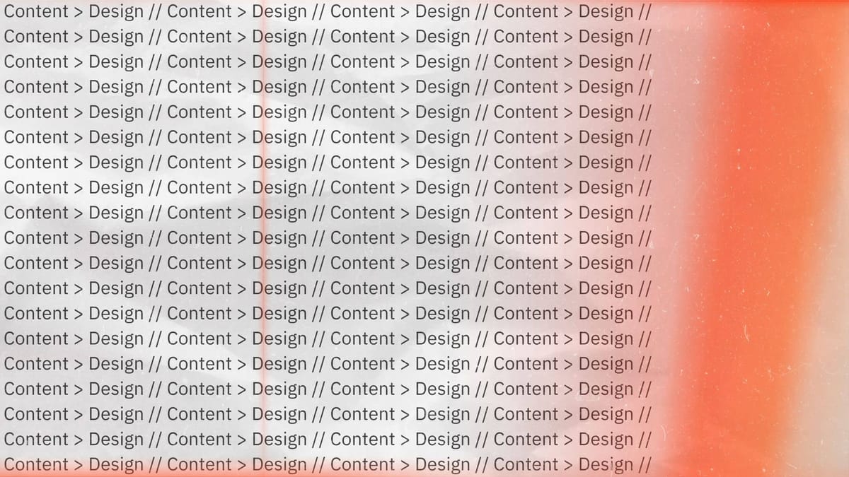
Content > Design (publishing with Writebook)
Content is why readers read.

Design cannot rescue failed content. —Edward Tufte1
Thanks to my RSS reader, I’ve had a pretty radical change of heart regarding what I think content on the web should look like.
The thing about an RSS reader is that it makes every single blog look the same. It simply displays all of the content from the websites I've subscribed to, strips out all the fancy formatting and CSS, and renders it in the system font for the device. It’s what the web would feel like if you decided to view everything in Reading Mode 24/7/365, without getting truncated output simply because the site wants to block reading view to serve you ads.
Prior to aggregating blog feeds into my RSS reader, I discovered a lot of my online reads by following email newsletter links from my favorite publications, which would take me back to their website, or I'd do the Neanderthal thing and go to specific blogs and publication sites at random.2 I encountered a unique, branded experience every time I read an article.
What I’ve learned since shifting to an RSS reader is this: I don’t actually care what the website looks like. I care about the content and all that that entails: the information, the perspective, the insight, the tone, the voice, etc.
The content is what matters.
The amount of effort that websites and blogs put into branding creates the impression that everything needs to be highly curated and super special from a design point of view. Major enterprise brands often commission custom typefaces or spend boatloads of money on high-end design to help reflect their brand.3 I love reading those case studies, and I love the deep thought and intentionality behind that work, but when the best reading experience is in the system font on your device, all of that spend is lost on the reader.
Publishing with Writebook
This simple realization felt more like an epiphany this past week after installing Writebook to create digital resources for our church. Writebook is a free software application from 37signals (the company behind Basecamp), and it makes publishing book length content on the web extremely simple.
Writebook provides a very simple interface for writing and for reading longform, book-style content on the web. That's it. All of the pages are structured in Markdown, and the formatting choices are curated to the most essential things you need when publishing longform content. The most branding I can do in Writebook is uploading an image for the book cover.
It’s possible to add some custom CSS, but things work so well out of the box that I can’t imagine wanting to do a lot of custom CSS with it. The only change I made was adding a left border to set off block quotes more strongly. It's simply not worth the hassle of creating classes when the baked-in formatting is already great. In fact, the most common feedback I received from my colleagues was, "Wow! It looks so clean!" Not one person commented on the fact that the built-in fonts in Writebook don't match our brand fonts.
Prior to my revelation about web content via my RSS reader, I may not have seen the true value in Writebook, but now I do. Not only does it make it easy to publish books on the web, it also highlights the main reason people are reading anyway: for great content. The true value of Writebook is that it makes the main thing (the content) the main thing. Design is important, but secondary. Write for readers, not for lookers.